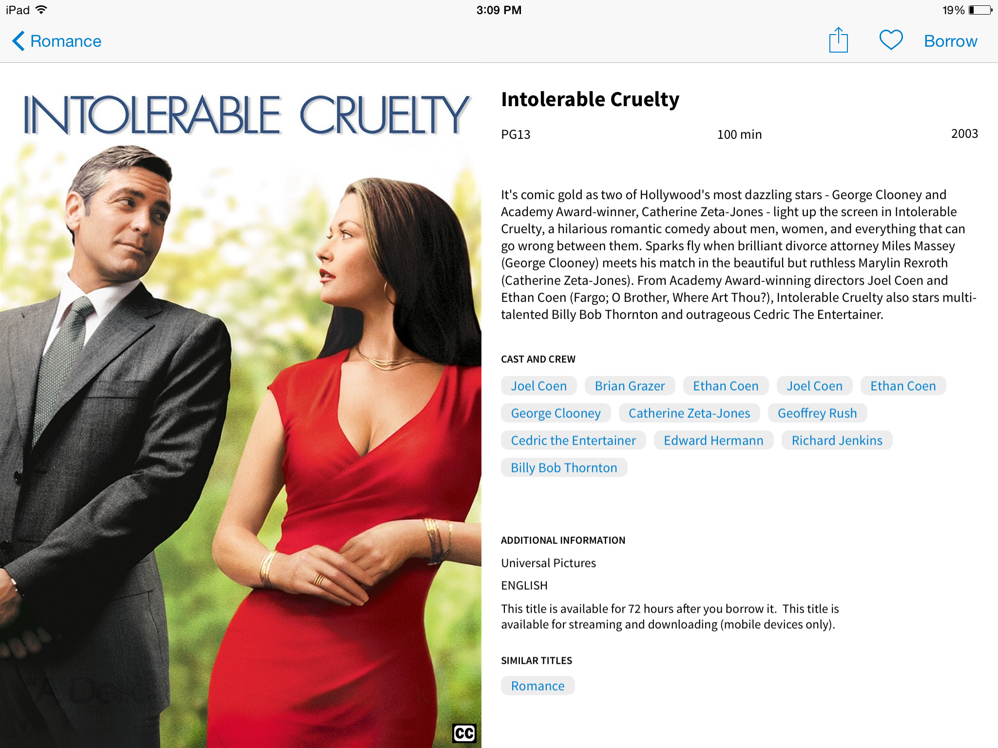
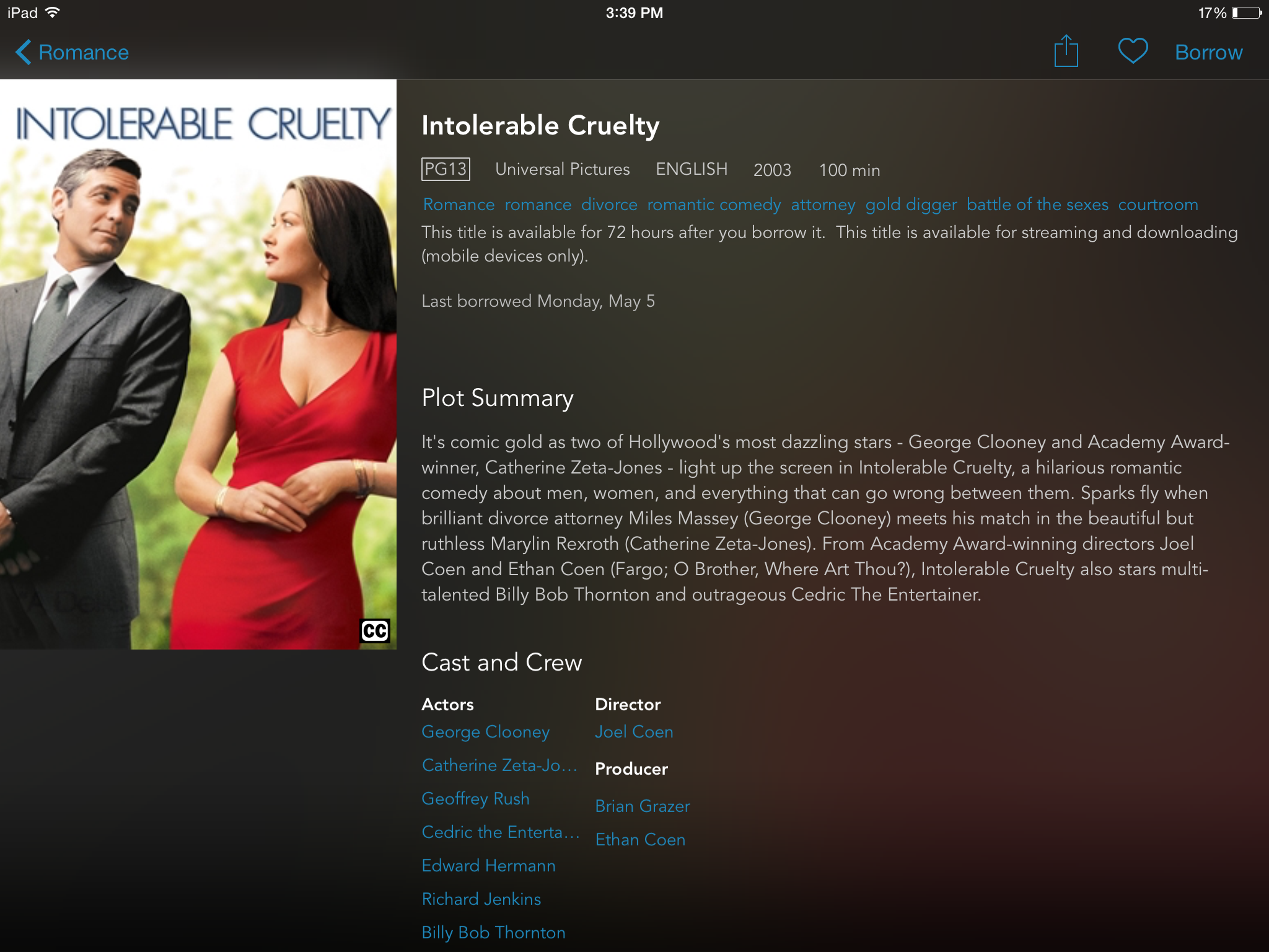
As we grow closer to the release of hoopla LightSpeed, we wanted to give our Partner Libraries a final preview of LightSpeed. In this preview, the goal is to better show and describe some of the exciting “under the hood” features, and the improvement to our individual title information pages. In line with our other improvements, our chief aim is to help our users find content of interest as quickly as possible.
With a little help from technology, LightSpeed provides a tailored experience by suggesting content to a user based on recent activity. Artists or series that have been marked as favorites will also be displayed in a user’s recommended content. As hoopla adds new content from a favorite artist, this content will be displayed in the first recommended slots.
Providing a lighter, easier to read description of a title is another focal point of LightSpeed. With the old app, most of the information on the title page was tough to read due to white font being displayed against a black background. Notice in the displayed image the change from the old hoopla app to LightSpeed. The difference is night and day.
We want to thank you for your input and the role you've played in LightSpeed's creation; and, to thank you in advance for the key role you'll play in patron communication of its features and benefits. Please be sure to check your device’s app store or hoopladigital.com soon for the impending release of LightSpeed. We know your patrons will love our app evolution for brighter connectivity!
To review the first stories in the LightSpeed preview, check out the original posts.


